

In order to make a chronograph, it turns out, we first had to attempt to make a jump hour. Doing this forced us to challenge everything we thought we knew about watchmaking. All of the best practices, the carefully studied rules, the time-honored conventions — those had to go. It was a journey without maps. And one that we’re still on. The quest for the jump hour continues. But along the way, we invented the design language that allowed us to bring the Chronograph to life. Today, we’re going to talk to you about exactly how it came to be.
Everything follows from the movement, so we’ll start there. We knew that we had to get this one decision exactly right, or the design we had in mind could never be rendered in steel. There was no room to compromise. We spent months evaluating numerous Swiss options before settling on the only viable choice. The Japanese-made TMI NE86.
Reasons of both form and function made this choice inevitable. The NE86 is 0.3 mm thinner than the closest viable Swiss competitors we assessed. It doesn’t sound like much, but in watchmaking, 0.3 mm is a lot. Yes, the Chronograph is a radical departure for us. But it’s still a TRASKA. Our watches are svelte. Since any available chronograph movement was already going to push the bounds of what we were comfortable with in terms of thickness, we needed to do everything possible to ensure we were making something that stayed true to our ideal vision.
Secondly, TMI's NE86 is designed to be used. Like all TRASKA watches, the Chronograph is meant to be a robust tool you will actually take into the real world, without fear. Thanks to the vertical clutch that engages the chronograph by pressing two discs together along the same axis (one connected to the running gear train and the other to the seconds wheel), there is no need for gears to vertically mesh together for the chronograph to function. Since engagement occurs without significant impact, the chronograph can run continuously without damaging the movement over time.
Finally, the NE86 also has another advantage that none of the Swiss options we considered could compete with: It uses a column wheel for a smoother pusher feel, resulting in cleaner engagement and more precise sequencing of the start, stop, and reset functions. Again, we wanted this to be something you’d actually want to use, and that would feel satisfying on the tactile level as well as the visual level.
What about the allure of being able to say ‘Swiss-Made Movement’? To us, performance beats perception every time. We choose our components based on this criterion alone, and would never sacrifice an iota of quality (or three tenths of a millimeter of thinness) just for the sake of a label. And besides, Japanese movements have served our customers and us exceptionally well for years now — we have no doubt that they will continue to do so with the Chronograph.
With this critical decision made, we were well on our way to making a chronograph that felt distinctly TRASKA. Many of the subsequent decisions follow in the footsteps of the Jump Hour, which blazed the trail the Chronograph would later follow. We had no idea, until quite recently, that the Chronograph would be ready first, while the Jump Hour is still winding its way to completion.
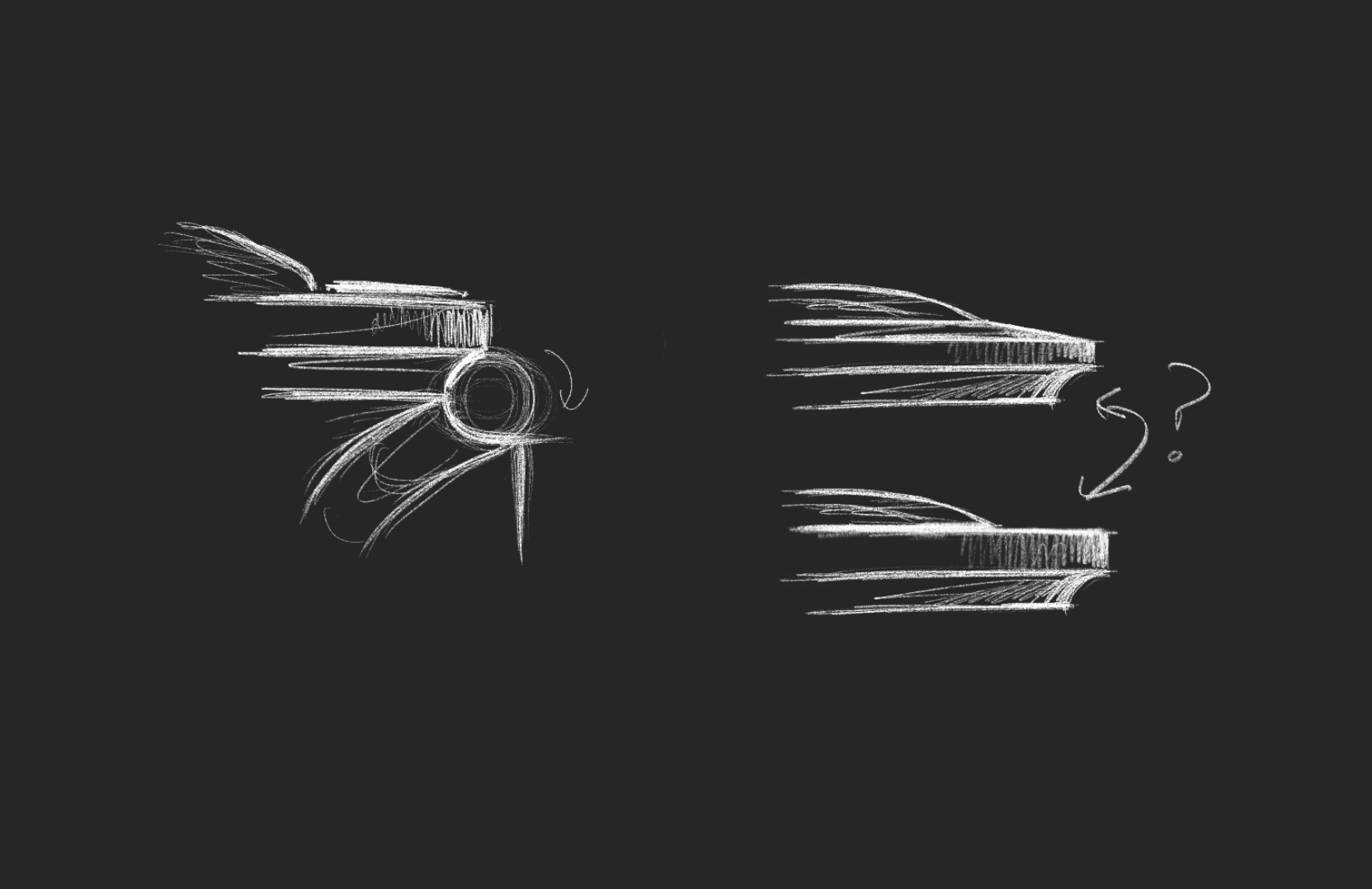
By sticking with a boxed sapphire crystal, a cleverly designed bezel with concave cutouts, and a case back that would absorb some of the movement, we could make a midcase that was the same thickness as that of the Jump Hour. We drew it up, and sure enough, it looked like this might just work…We made some 3D prototypes of the case and crystal, put it on a strap and… it felt good! Like really good. We wouldn’t want it to be any thicker, but at the same time, it wouldn’t really benefit from being any thinner either. The proportions were everything we hoped they would be and more. It felt right.

Because of the movement, we knew this inevitably was going to be more premium-priced than the existing pieces in our collection. The whole watch had to feel worthy of this. Fortunately, we’d made great progress while working on the Jump Hour, etching out a highly decorated case and bracelet architecture that the Chronograph would come to inherit. Featuring polished concave cut-outs on the upper portion of the midcase instead of a chamfer, the otherwise paired-back case truly shines upon close inspection. This same design detail can be found on the lower portion of the bezel. When the two pieces meet, a perfect semi-circle comes to life. The bracelet is also our most premium yet, with polished chamfers wrapping around the edges of each individual link’s flanks.
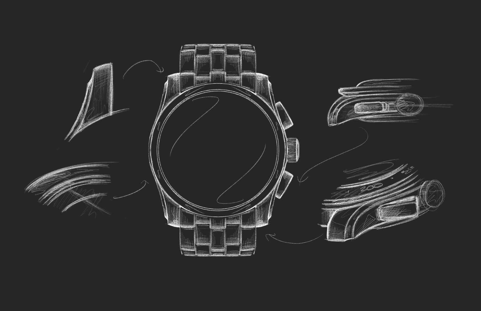
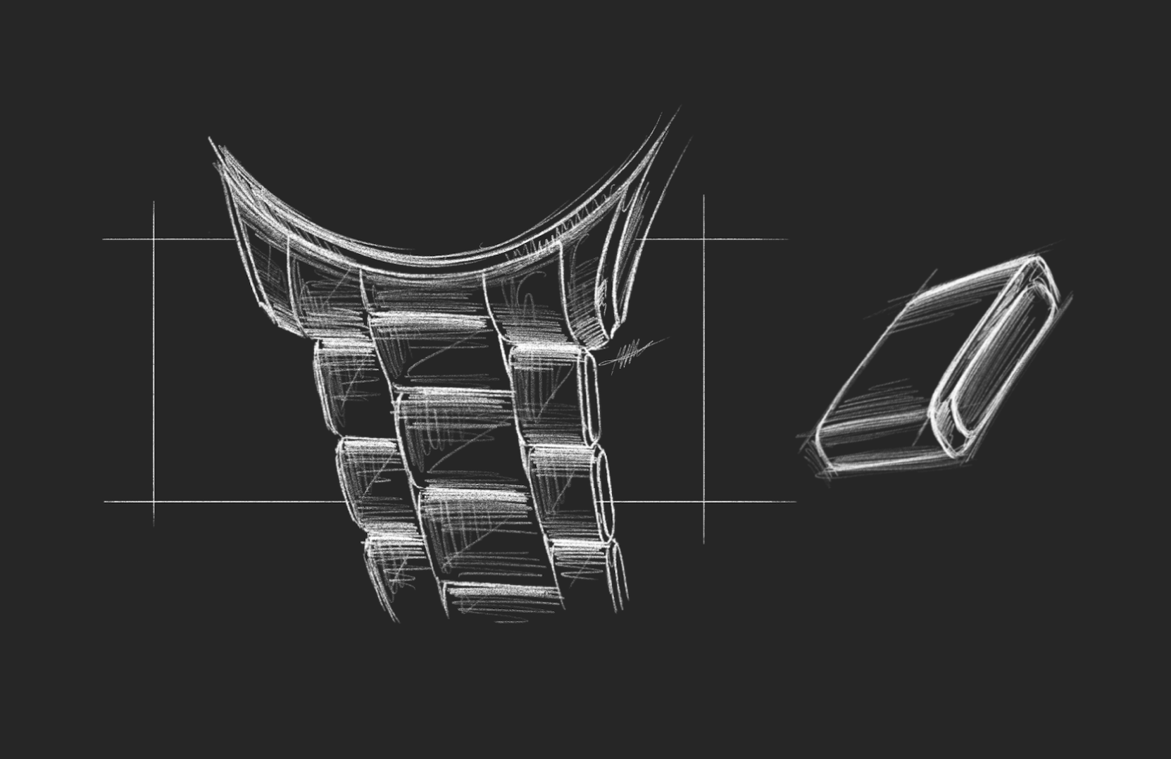
The Chronograph’s case measures 39 mm; while it may be expected of us to pair this with the industry standard 20 mm lug width, we refuse to decline any opportunity to enhance the overall visual appeal of the watch. You can’t please everyone, and we don’t set out to do so. Choosing a 21 mm lug width has some cost; for those who like mixing up straps, fewer options exist in this range. But the visual intrigue created by aligning the case diameter with a slightly larger lug width was simply something we couldn’t pass up.
The next step was designing the bezel insert, pushers, and, of course, the dial. After years of having a chronograph in the back of our mind, now that the time had come to finally do it, we suddenly felt a little stuck. Where do we go with this? As usual on this journey, the Jump Hour held the clues.
The Jump Hour’s design is rather experimental compared to the rest of our collection. When we first thought of making a chronograph, we never expected that in the future our tastes might branch out from our usual utilitarian tool watch DNA into something like this, but having gone on this journey with the Jump Hour, it was only natural that a bit of this more audacious design spirit be infused into the Chronograph. It was time to step well and truly out of our comfort zone.
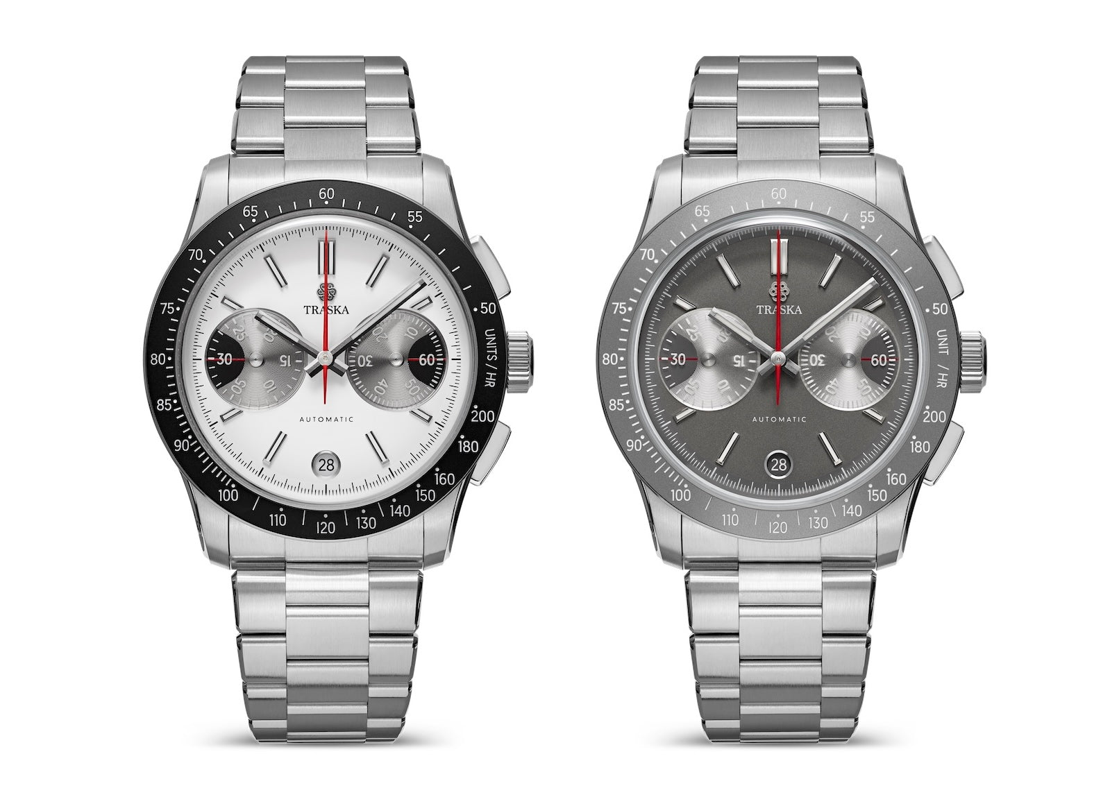
Certain elements initially conceived for the Jump Hour naturally felt at home on the Chronograph. The indices and hands could be incorporated into the dial naturally and with relative ease. But the subdials? It’s a circle, some numbers, and a hand. One could not fault someone for thinking there isn’t much else to do here, and indeed, this feature seems to be the same across virtually all chronograph models we have seen.
Well, there are “big eye” chronograph subdials out there. Those are different and pretty neat. But that wouldn’t work for our NE86-powered chronograph. You see, the big eye subdial is always on the right side of the dial, right next to the pushers. This works. The eye gravitates to the larger subdial, and next to it on the outside of the watch are the pushers. There’s mass, and right next to it, more mass. Despite the asymmetrical nature of such a design, it’s visually pleasing.
However, the NE86 is somewhat unique in that the minute register is on the left side, while most chronographs feature it on the right. The big eye detail only makes sense because it highlights the most important function of the chronograph — the minutes counted since actuation. And the whole asymmetrical yet pleasing thing? That only works when you have the mass of the big eye next to the mass of the pushers. Highlighting the seconds subdial instead to make the design visually pleasing would be a solution to the visual problem, but functionally, it just would not work. There is no reason for the less important of the two subdials to be the one that's highlighted. So we did the only logical thing we could think of and enlarged the eyes of both the subdials. Two big eyes. No small eyes.

Things were coming together, but we still weren’t quite there.
We still felt a desire to harness some of the avant-garde magic we found when designing the Jump Hour. Despite the now owl-eyed nature of the subdials, we felt they still weren’t exciting enough. Our aim was to create a chronograph dial the likes of which had never been seen before. At the same time, TRASKA is still TRASKA, and every decision has to be driven by a functional rationale; there was no room for strangeness for its own sake. Everything has to exist for a purpose. And so we got to thinking… Does a chronograph really even need hands?
We imagined transparent discs suspending the numerals over a printed red line, making them appear as if they were floating above the dial. Now this would be the kind of harmony between form and function that gets us excited. It would declutter the dial, while still making the elapsed minutes and running seconds readable at a glance.

Next up were the pushers; the buttons responsible for activating and resetting the chronograph function. Pump pushers would be the predictable move, but we wanted to walk the line between the sporty DNA of our existing collection and the more dressy looks of some of the 1940s chronographs we’ve long admired. Besides, with an external tachymeter bezel, this chronograph was sporty enough already. We could afford to tone that down a bit with some rectangular pushers with chamfered edges. The goal was for this watch to be familiar at a glance, yet at the same time utterly unlike anything else out there once you actually got a good look at it.
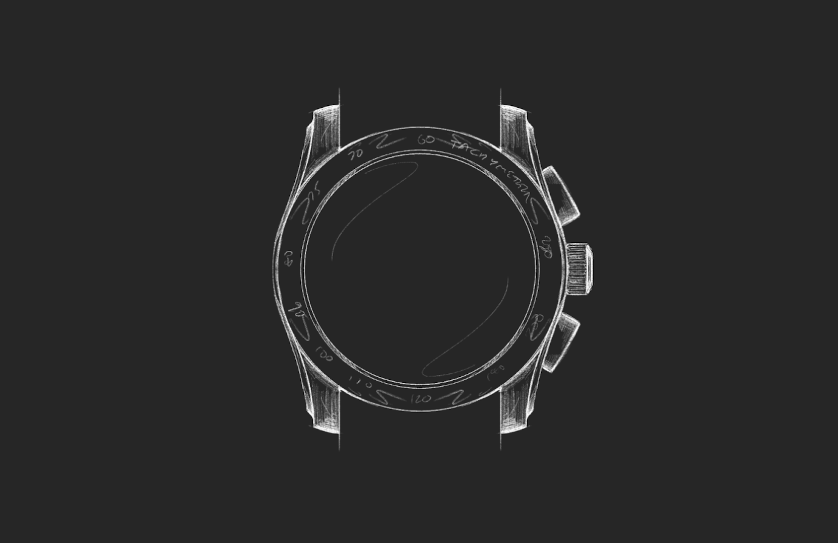
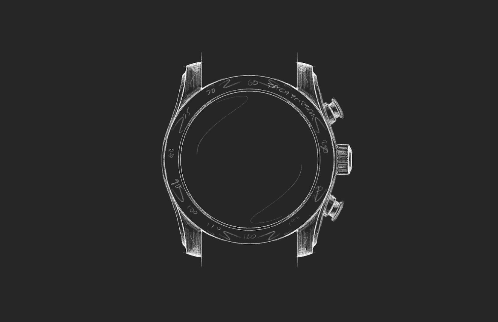
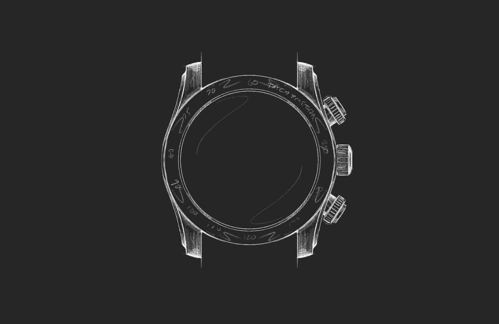
Next, we turned our attention to the bezel insert. This is a seemingly simple part of the watch, yet we still wanted to dial it up. We’ve used both steel, sapphire, and ceramic inserts before, but this time we wanted to use something a little more exotic. Whichever material we chose would still need to be scratch-resistant, of course, but it also needed to be visually interesting. Enter tungsten. A metal known for its industrial applications in cutting tools, aerospace technology, and ballistics. And it also has an interesting gun-metal-like hue quite different from anything else out there.
Finally, we come to the tachymeter markings. Most chronographs with a tachymeter scale measure units per hour in a range from 400 to 60. 400 units per hour is fast. Really fast. Who even needs to measure something that fast? Our watches are designed to actually be used, so we decided to slow things down, compressing the tachymeter scale range to 200-50 units per hour. We feel like this scale will have more real-world applications for those of us not in the habit of high-speed racing. What are those real-world applications, you ask? Well, you’ll just have to tell us.
And that, friends, is how you end up with discs instead of hands, symmetrical owl eyes, 21 mm lugs, and a bracelet that tapers steeply from 21 to 16 mm. Not one aspect of this watch was left to chance. No convention was followed simply because it is a convention. At the same time, nothing was changed merely for the sake of change. The result is a watch that is exactly who we are. A little unusual. A little strange, perhaps. But for the right kind of person? You may find it's exactly what you’ve been searching for.

The Jump Hour had blown open the door. All the Chronograph had to do was walk through.
THE CHRONOGRAPH
ONWARD